Alerts Graph
Instead of the traditional tabular view of flow alerts, this graph lets you visually explore how alerts are connected across hosts, making it much easier to spot patterns such as brute force attempts, obsolete TLS/SSH versions, periodic flows, possible C2 traffic, botnets, and similar issues, simply by looking at how alerts are distributed and propagate across the network.
Note
This feature is available from the Enterprise L license
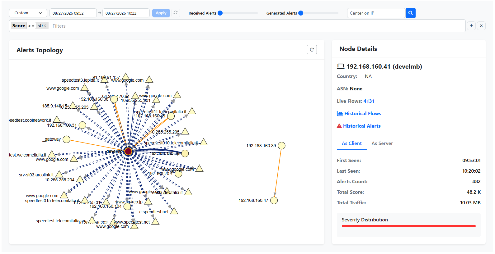
Alerts Graph
Graph Structure
The graph represents, for a given time range, all the hosts involved in flow alerts and the alerts connecting them:
Each node represents a host:
a triangle is a remote host
a circle is a local host
Each edge represents an alert, with the arrow pointing from the originator (flow client) to the target (flow server) of the alert.
This makes it straightforward to spot hubs, i.e. hosts responsible for generating or suffering a disproportionate number of alerts compared to the rest of the network, as well as to follow how an alert on one host may have triggered further alerts on other hosts.
Color Insights
Colors provide an immediate severity overview of the graph:
Edges: light yellow indicates a low alert count between two hosts, while orange/red indicates a high alert count.
Nodes: the more red a node is, the higher its alert score, i.e. the more it generated or suffered alerts. Every issue detected in a flow contributes a score between 0 and 150, and a flow alert can be made up of multiple issues, so the total score of a host is the sum of all the issues affecting it.
How To Use The Alerts Graph
Single click on a node to show detailed host information (IP, Country, Autonomous System) in the side panel, together with quick links to that host’s Live Flows, Historical Flows and Historical Alerts for the selected time range.
Double click on a node to filter out all the noise and only show the alerts concerning that specific host.
Clicking a node also highlights its blast radius, i.e. all the paths that originate from it, letting you quickly see how alerts may have propagated starting from that host. This is currently an approximation, as a fully causal reconstruction would additionally require taking the time dimension into account.
License Pre Requisites
The Alerts Graph visualizes historical flow alerts stored in ClickHouse, using flows either collected directly by ntopng or exported to it from nProbe. This feature requires ntopng Enterprise L (or above) or nEdge Enterprise L (or above), together with ClickHouse enabled as described in ClickHouse Timeseries.
Once enabled, the Alerts Graph can be reached from the left sidebar, under Alerts -> Alerts Graph.
More information on this feature, along with example screenshots, can be found on our blog post: https://www.ntop.org/introducing-ntopng-alerts-graph-visualize-security-events-like-never-before/