Seeing Where Your Traffic Goes: Flow and Alert Geomaps

A flow table tells you which hosts are talking. A map tells you where. ntopng has two geomap views built on the same idea: one for live flows, one for flow alerts and together they answer “who are we communicating with around the world” and “where are the alerts coming from”. Here’s how to use both.

Live flows on a map

First, pick the interface you want to look at. Use the interface dropdown at the top left of the page.

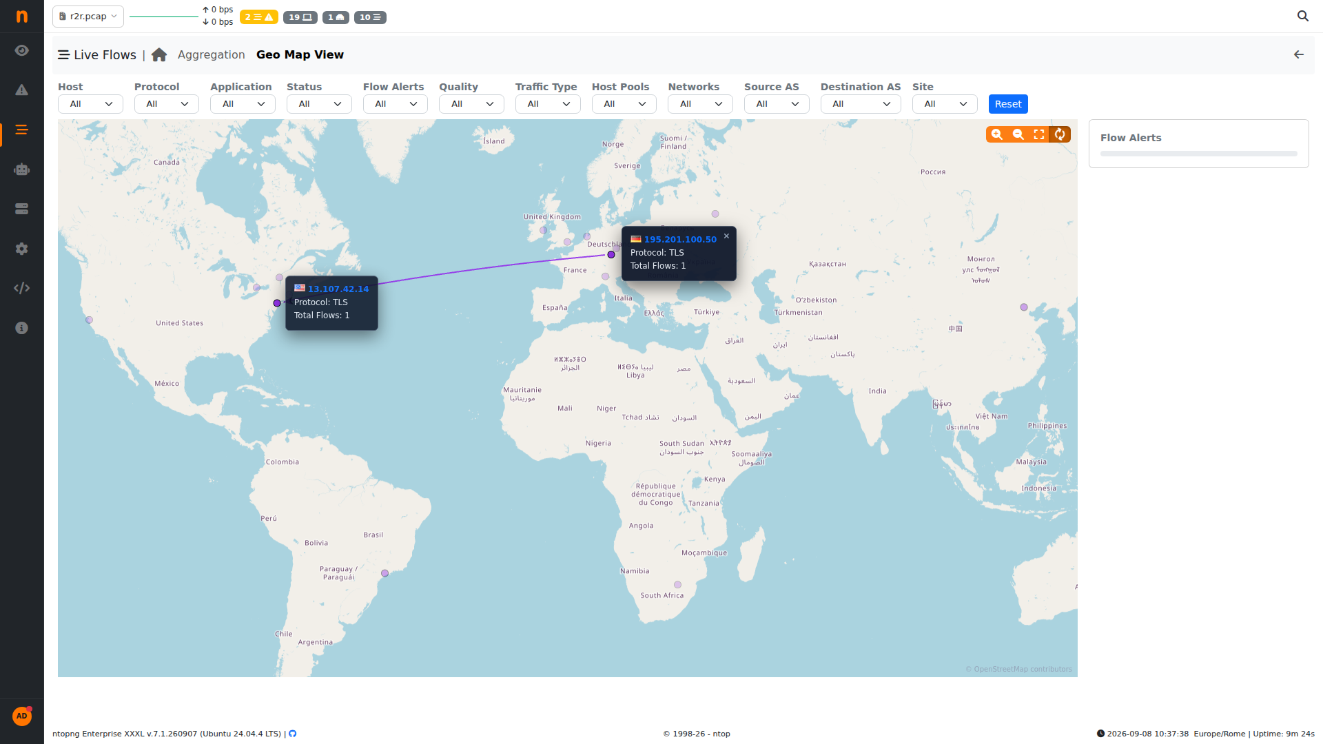
Open Flows > Live Flows > Geo Map View. You get a geomap chart to visualize clients and servers (dots) and flows between them (edges).

Click a marker and ntopng shows a small popup with the endpoint IP, the protocol and the number of flows to that location — enough to decide whether it’s worth opening the full flow. When hovering or clicking a certain edge or dot, ntopng automatically hides dots and edges not connected to the hovered or clicked dot. This to enable easy visualization and analysis.

Where alerts terminate: the alert geomap heatmap

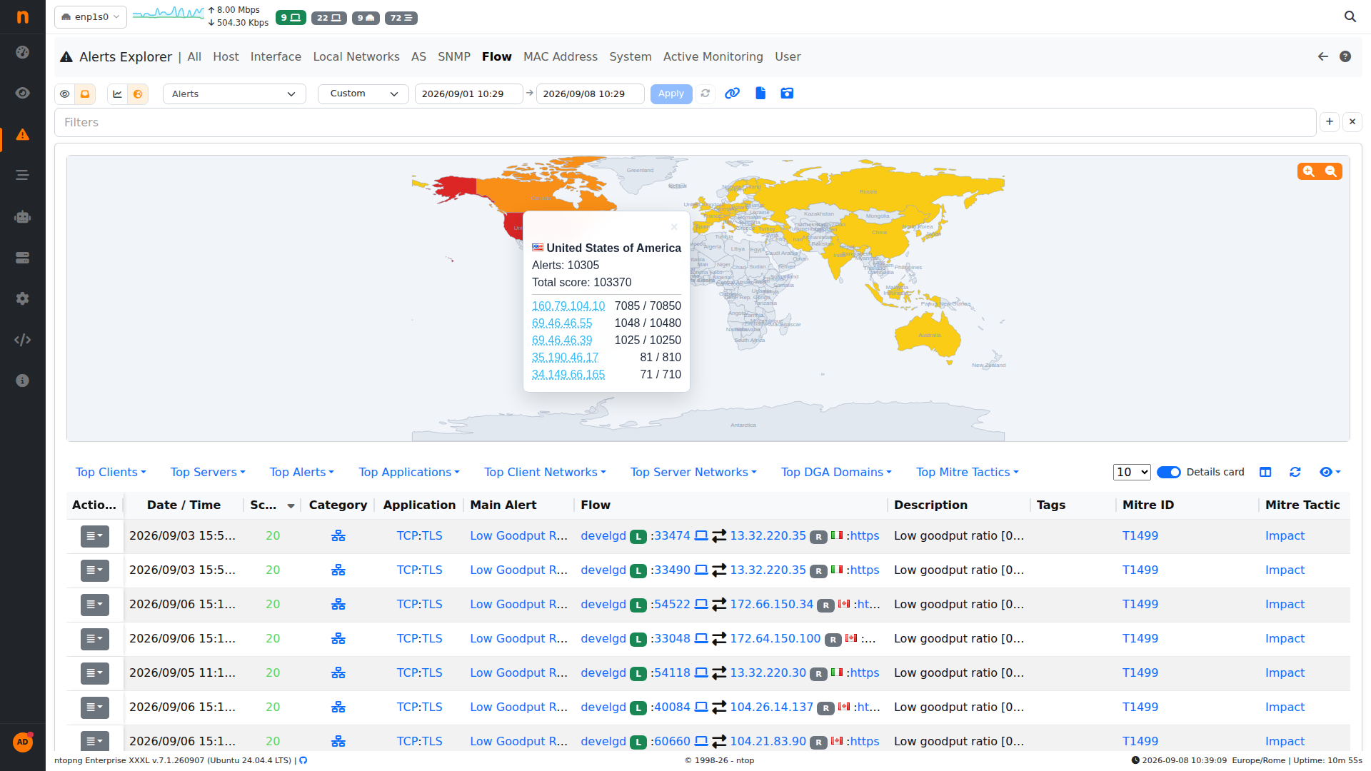
In addition to live flows, we also would like to visualize the distribution of alerts country. In the Alerts Explorer, on the Flow alerts page, switch the chart to Geomap. Instead of arcs, you get a heatmap: each country is colored by how much alerted traffic starts or ends there, so the countries from which clients or server generate or receive alerts are immediately visible. Hover over a country and ntopng breaks it down: total alerts, total score, and the top offending IPs with their per IP alert count and score. In this capture the United States accounts for 10,305 alerts and a total score of 103,370, driven by a handful of addresses. Between the two views you can go from “something is generating a lot of alerts in one region” to the specific flow and its MITRE mapping in a couple of clicks, without leaving the map. Geomaps are

The Flow Details side card

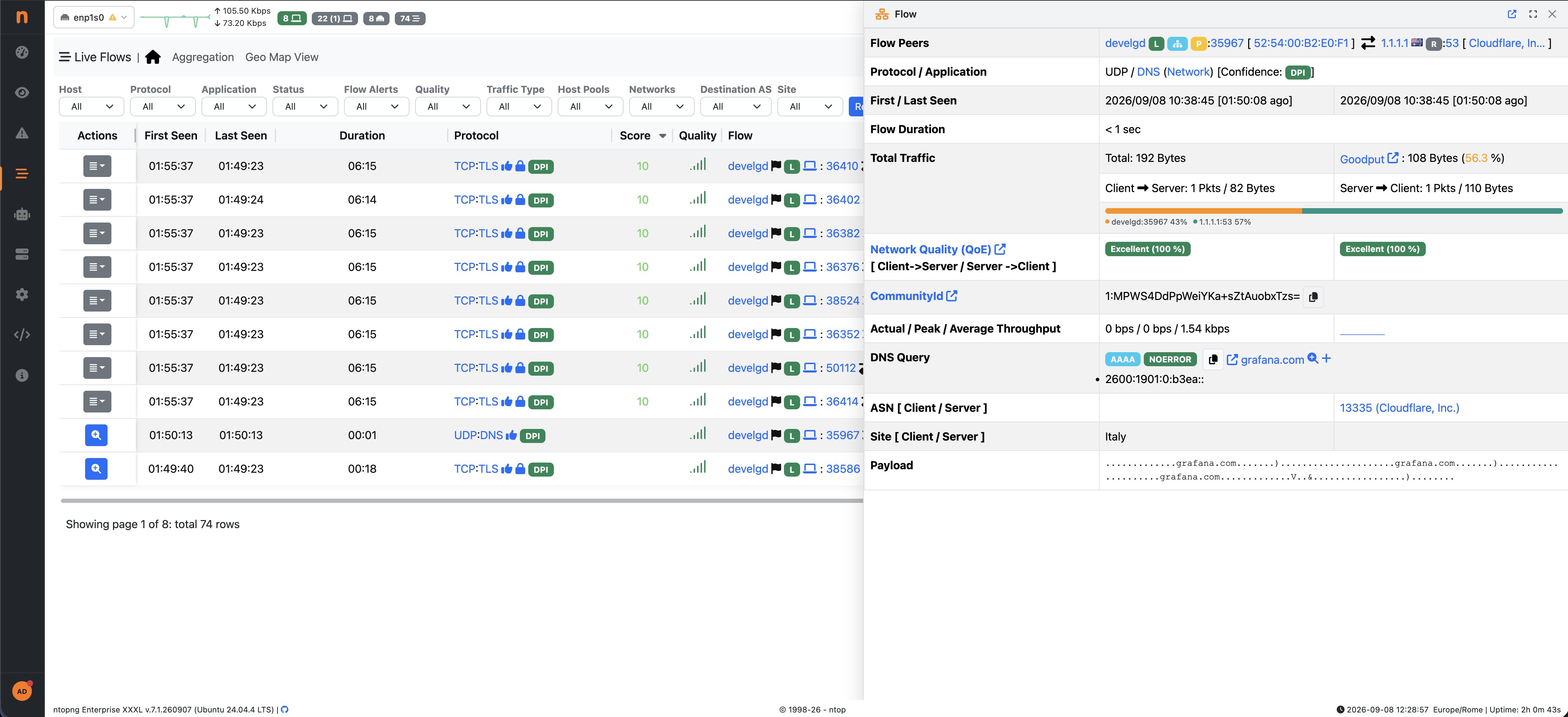
Now let’s show another new feature, flow details  and alert details preview. When you want the full picture of a flow, ntopng can open it in a side card that slides in from the right instead of navigating away to a details page. Whether it does this is controlled by a preference: Preferences > User Interface > Flow Details Side Card. “If enabled, clicking a live or historical flow (or a flow/alert row) opens the details in a side card. If disabled, the full details page is opened directly instead.” There’s also a Details card toggle right in the Live Flows table header, so you can flip the behaviour without leaving the page. Additionally, for ease of use, when the details card is open, by clicking the “space” button, the details card expands to fill the whole page, instead, by clicking “esc” it closes.

one of those features that are easy to skip past until the day you need them. If you use them and have ideas for what else should be on the map more detail in the popups, extra breakdowns on hover let us know on GitHub.

Enjoy, and stay secure out there!

Share