Network security analysts often struggle to understand how alerts are connected across different hosts. Traditionally, ntopng displayed flow alerts in a table format, perfect for listing issues, but limited when it comes to spotting patterns or identifying which host is the real problem or victim. Additionally, tabular visualization does not let security analysts or network managers quickly determine which problem to tackle first, causes alert fatigue what are the main network issues, such as brute force attempts, obsolete TLS or SSH version connections, periodic flows etc. These issues are now solved with the ntopng alerts graph!
What is the Alerts Graph?
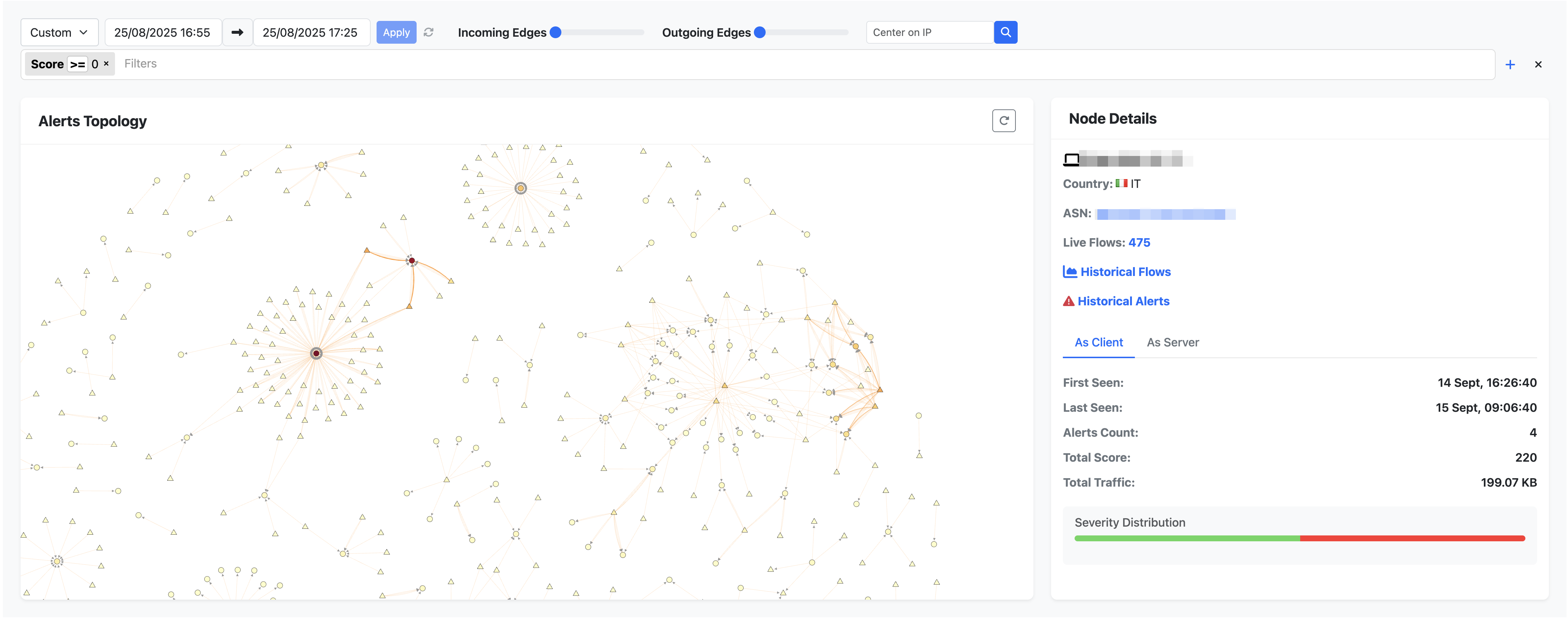
The alerts graph lets ntopng users easily visualize security events like never before. This graph helps understand what exactly happened in a network on a predefined time range, not as a simple list but in a graph, so that we can easily detect who suffered or generated a flow alert, and how alerts spread across the network.
- Each node is a host
- Triangle is remote host
- Circle is localhost
- Each edge is an alert
- Arrow direction shows the originator (flow client) and target (flow server) of the given flow alert
This representation makes it easy to model the relationship between alerts and quickly identify graph hubs (Wikipedia: https://en.wikipedia.org/wiki/Hub_(network_science)), in our use case a hub is a node responsible for generating or suffering many alerts compared to others. Not only this, it is also possible to see how one host generated an alert towards another host, and how these alerts propagate through the network and chain react.
Alerts Graph
Color Insights
The alerts graph is not only about modeling relationships between host alerts, it also shows impactful events at a glance:
- Edges (alerts between hosts):
- Light yellow indicates low alerts count
- Orange or red indicates a high alerts count
- Nodes (hosts):
- The more red the node, the more alerts it suffered or generated (higher the score)
Talking about score in ntopng, each issue detected in a flow has a single score ranging from 0 to 150. A single flow alert may be compose of one or more issues, so the total alert score is the sum of all issues. This gives you a quantifiable severity index for each host.
How To Use The Alerts Graph?
The alerts graph is designed for fast alert investigation, the. first step towards hyper automation in ntopng alerts analysis. To navigate this page simply:
- Double click a node: denoise all events and simply show the alerts concerning the clicked node.
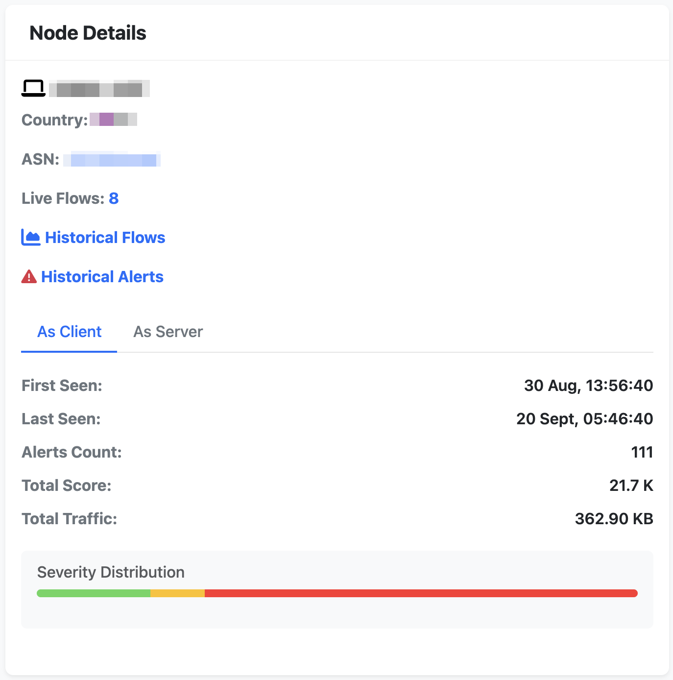
- Single click a node: get detailed host information on the side panel; such as IP, country, Autonomous System (AS) and hyperlinks to:
- Live flows
- Historical flows for the selected time range
- Historical alerts for the selected time range
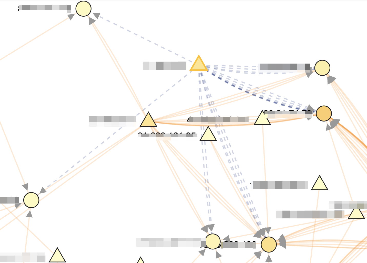
- Blast radius view: clicking on a node highlights all paths that start from the clicked node. This lets analysts quickly identify which alerts have propagated starting from the clicked node. This is currently an approximation as causal relationships can only be modeled with a new dimensionality: time. This will be discussed later.
Why is this a Breakthrough Feature?
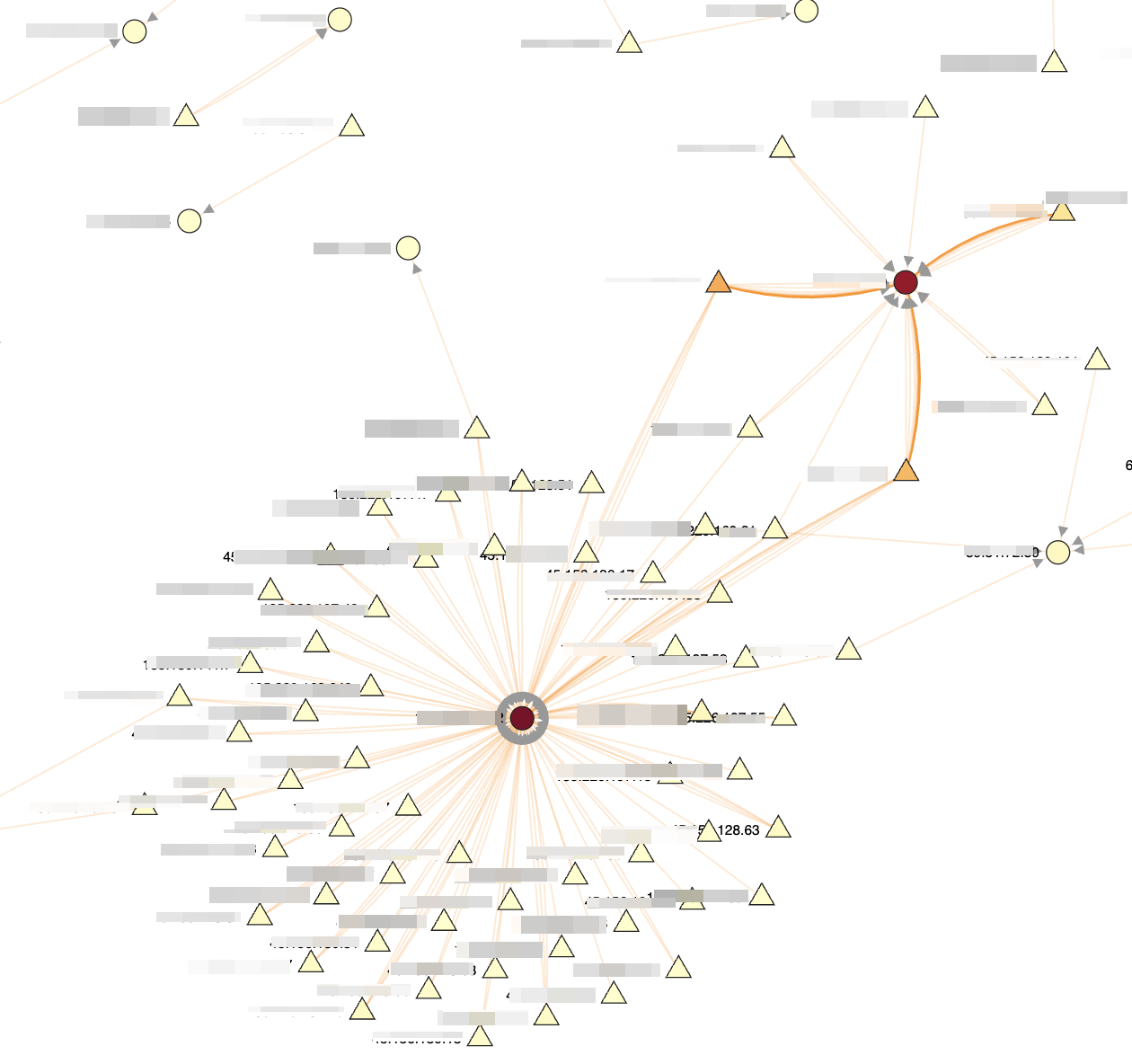
The main difference between the alerts graph and the standard ntopng table is that in a big network, the table does not let quickly identify issues to start to investigate. It could be possible that many alerts are generated and presented in the table, without letting analysts immediately pinpoint issues, problematic hosts and tackle the highest risk problems to keep a network healthy and determine the biggest cyber risks in the monitored network. Instead the graph, with a quick glance, lets users immediately detect hubs (example shown below) to detect:
- Victims: many incoming edges
- Attackers (or troublemakers): many outgoing edges
What’s Next?
The next natural evolution of the alerts graph would be to add a new dimensionality: time. This will allow analysts to:
- Watch how alerts unfold over time
- Trace causal chain, for example how an alert from host A to B may be the cause for a later alert generated from host B to host C
- Identify root causes and domino effects in alert generation
Pre Requisites
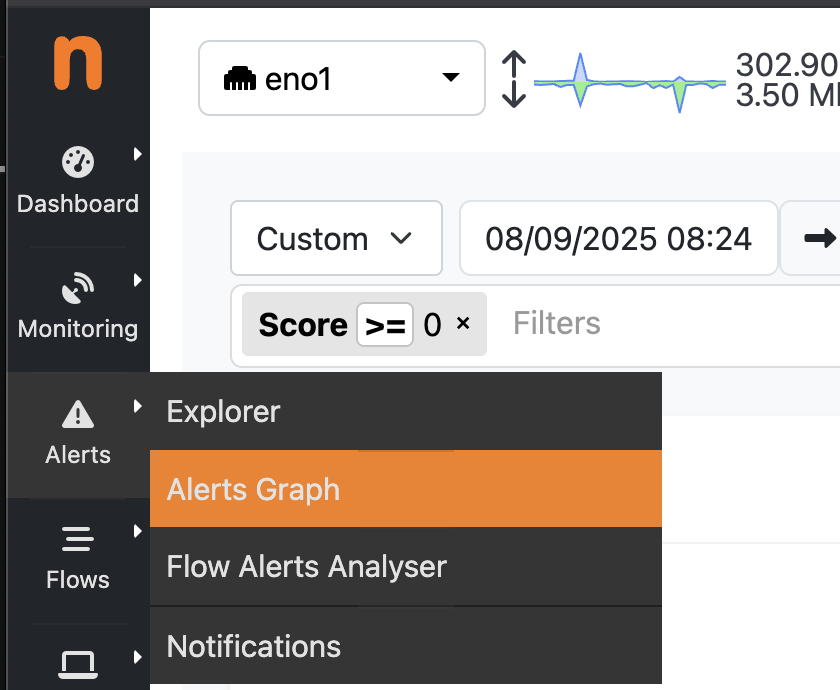
The alerts graph visualizes historical flow alerts stored in clickhouse. Flows are either directly collected with ntopng or exported to ntopng from nProbe(s). To enable this new feature ntopng enterprise L or nEdge enterprise L are required, together with the usage of clickhouse (https://www.ntop.org/new-fast-scalable-clickhouse-integration-for-high-volume-networks/). To find the new menu entry, simply click on left sidebar -> Alerts -> Alerts Graph and the new page will be visualized
Conclusion
The new Alerts Graph in ntopng transforms the way analysts approach network security monitoring. Instead of flooding the interface, increasing alert analysis fatigue, you now get a connected, color coded graph that highlights relationships, severity and problematic hosts, empowering faster and smarter decisions, reducing alert fatigue and SOC analyst