What an AI Dashboard actually is
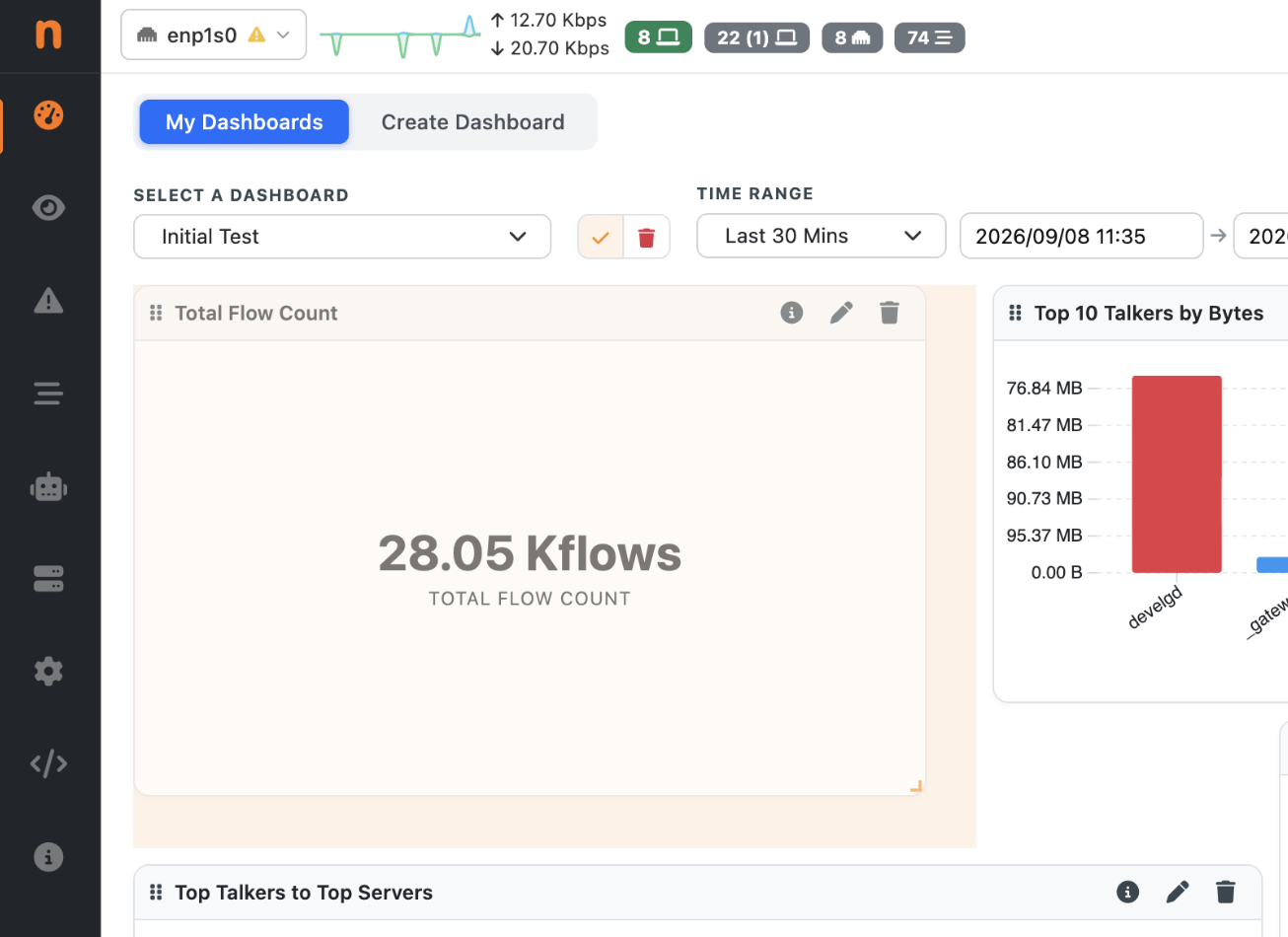
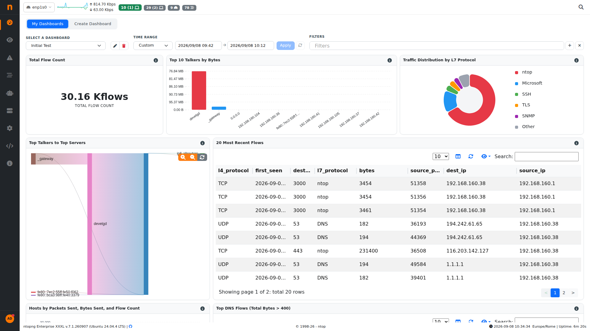
An AI Dashboard is a saved layout of widgets, each backed by a ClickHouse query against your historical flow and alert tables (and Wazuh alert data, when that integration is enabled>. To read more about Wazuh and ntopng integration please read: this blogpost ). A widget can be a single number, a bar or line chart, a pie/donut, a Sankey diagram, a geomap or a plain table. The dashboard carries its own time range and an optional filter bar, so every widget on it reacts to the same window and the same filters at once. The same filters as the historical flows are used, so users do not feel confused. Dashboards live under the My Dashboards tab. Pick one from the selector, set the time range, and read. Each widget has an info icon that shows the exact SQL behind it — useful when you want to know precisely what “top talker” means in that chart, or when you want to reuse the query elsewhere.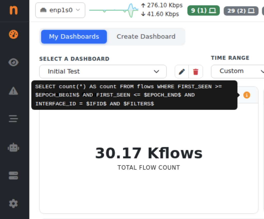
Building a dashboard
Switch to the Create Dashboard tab. You either start a new dashboard or open an existing one to extend it. On the right there’s a prompt box with a few starting points — “Top 10 talkers by bytes in the last hour”, “Pie chart of alert severity distribution”, “Sankey of top talker to top server traffic” — and the LLM model ntopng is configured to use.
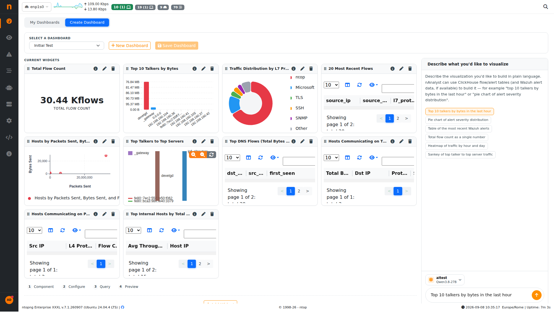
Type a request and send it. nAnalyst inspects the relevant tables, builds a query, validates the SQL, runs it and renders a preview. You can see its reasoning as it goes — which table it chose, why a bar chart fits a ranking, what the query returned — and then a “1 widget(s) ready — review below” line with the new widget marked Needs review.
Nothing is committed until you review the new widget and hit Save Dashboard. That review step matters: it’s your chance to check the generated query against what you actually asked for before it becomes part of the layout.
Editing what you built
Every widget on the Create Dashboard grid has an edit (pencil) and a delete (trash) control. The build flow is a four-step wizard Component, Configure, Query, Preview so you can edit any widget and change the chart type, change the SQL by hand, adjust the title, resize the widget size before saving. The layout grid is drag and arrange, simply use the mouse to drag from the widget title and to resize, hover the bottom right of the widget to resize.
Because the widget is just a query plus a chart definition, an AI Dashboard is not a black box. The LLM gets you to a working widget quickly; the wizard lets you test and modify if something is wrong.