
Traffic monitoring applications often aggregate traffic in flows, that in essence is a way to divide traffic according to a 5-tuple key (Protocol, IP/port source/destination). Flows are then aggregated for instance according to IP address or protocol, and often represented with timeseries as the one below.
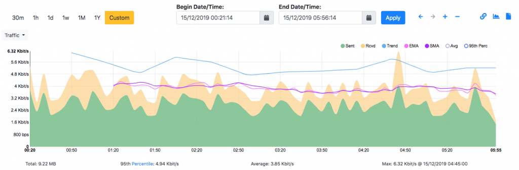
What is missing in all this is how the traffic is distributed over time as everything is flattened, protocols are merged (for instance according the source IP address) and it is not possible to understand intra-flow relationships. For instance to see that when I connect to a remote host, my PC first issues a DNS request to resolve the remote host IP, and them the SSH communication is created.
In order to represent these relationship, and thus understand more about flow interactions, we have created a new tool for nDPI named ndpi2timeline. This tool leverages on Google Chrome/Chromium tracing capabilities to show flow interaction. Usage is simple:
- Suppose that you have saved in
test.pcapthe traffic you want to analyse with nDPI. - Type
ndpiReader -C test.csv -i test.pcapso that you can save on test.csv the result of nDPI in CSV format. - You can now convert this CSV into a JSON file that can be visualised in Chrome according to this format. Type
ndpi2timeline.py test.csv test.json - Open Chrome and set as URL
chrome://tracing/then drag onto the Chrome window the filetest.jsongenerated at the step above, or simply load with the ‘Load’ button.
The result is shown in the figure below (Note that this tool is used to trace processes so the work ‘Process’ might be misleading in the figure). The traffic is sorted according to each host (192.168.1.33 in the example below) and for each protocol detected by nDPI a horizontal line is created. Clicking on the line, further information is reported at the bottom of the windows (in the example the DNS query that has been performed).
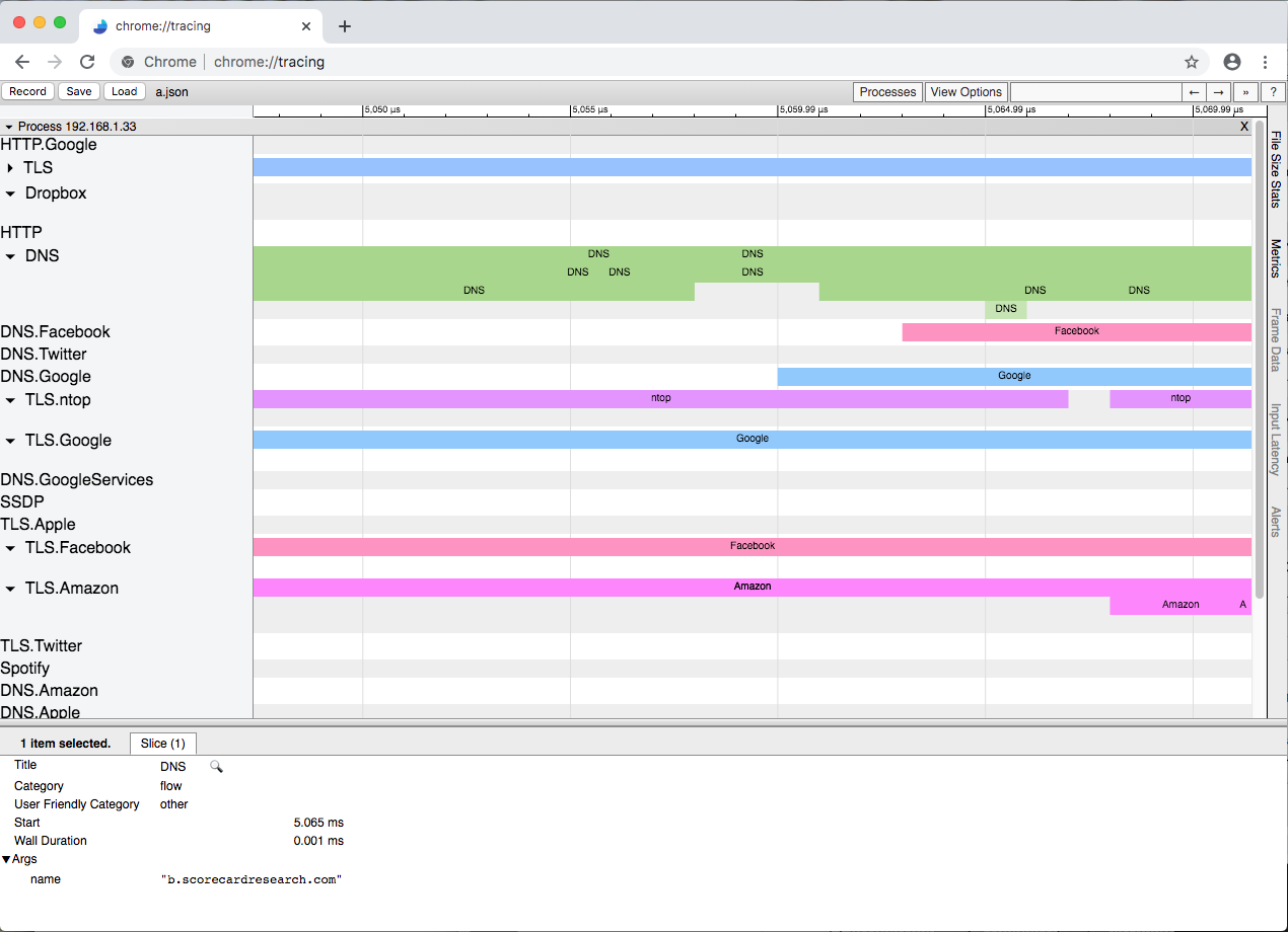
This example shows that it is now possible to depict the flow interactions with a timeline and interactively zoom/drag/drill-down with the mouse. In order to create a report that can be easily navigated, we have decided to collapse flows generated by the same host/protocol in the same line, however this can be changed as necessary changing a couple of lines of code. All this is just an experiment, to demonstrate that the standard timeseries-based reports can now be rethought. In particular, we believe that tracing tools such as Zipkin and Jaeger could be very well used to moving this type of visualisation to the next level. After we complete all these experiments, we’ll likely integrate the results in ntopng.
Please send us your feedback. Enjoy!