The latest ntopng 4.0 has a renewed look. The main changes we have introduced are:
- An always-on-top status bar. Key information on the health and status of the network is essential for the analyst and it must be always visible and easily accessible. This is why we have introduced an always-on-top fixed status bar with key information such as network throughput, active hosts, flows, and ongoing alerts. This information was previously placed at the bottom of every page so it was difficult to access it and a lot of scrolling was necessary.
- An optimized layout for wide screens. 16:9 wide screens are common so it is important to optimize the layout of the pages for this kind of screens. Hence, we have introduced a vertical main menu bar on the left. The main ntopng menu bar was formerly horizontal and this was taking precious space that can now be used for actual page data.
- Dark and light themes. Being able to choose the colors of the graphical user interface it is not only a matter of personal preferences, it is also very helpful for those who spend a lot of time in front of a screen. Having darker colors helps relieving eyestrain of people who look at screens for hours and hours every day. Therefore, to help those people, we have added a dark theme. Another light theme is also available for those who prefer a bright interface. Those two new themes come in addition to the default one.
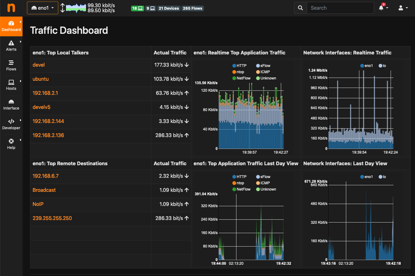
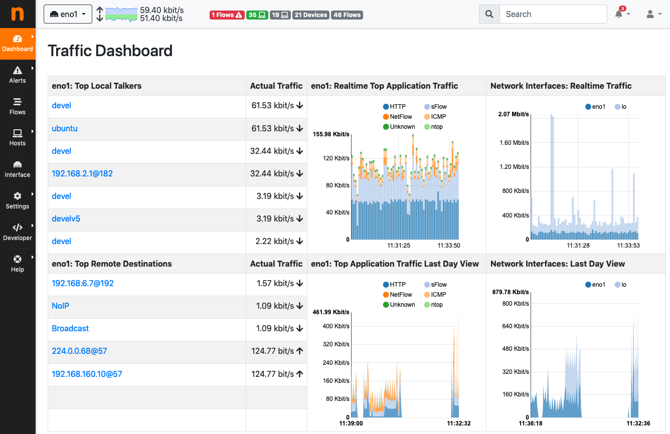
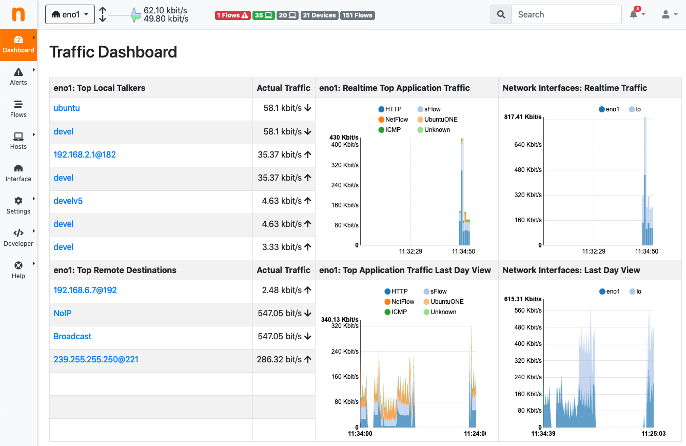
Want to see the results? Here are some screenshots
Well, now its time for you to try ntopng 4.0 out! Check this page out to find a package for your distro: https://packages.ntop.org/.