One of the main concern of our users is the ability to scale ntopng with a large number of hosts/protocols and hence how to scale time series. As already discussed, RRD has many limitations with the increase of number of time series, hence it was time to start exploring new paths. We decided to abstract the ntopng engine from RRD and thus open up the engine to new time series databases. This has enabled us to use InfluxDB to store time series instead of RRD, that (as already discussed) enabled ntopng to scale both in number of time series and speed. While our work is still ongoing, this post will explain you how to move to InfluxDB and to the new time series reports (they work with both RRD and InfluxDB, seamlessly, thank to the engine abstraction).
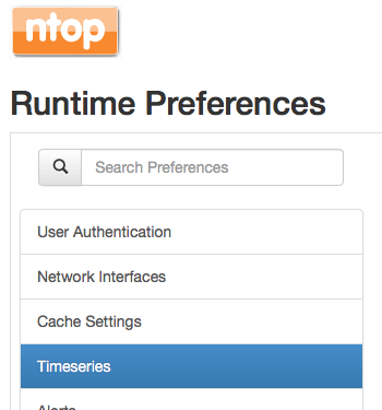
Suppose that you have installed InfluxDB and created a database named ntopng as described in this readme (soon the database creation will be automated and this step won’t be necessary). You need to tell in ntopng preferences to use InfluxDB.
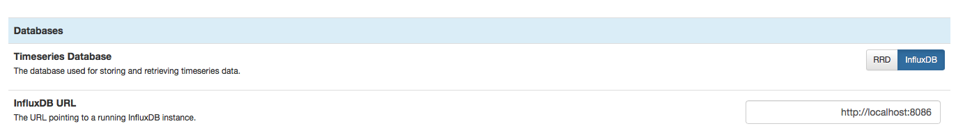
At this point you moved ntopng to InfluxDB and all the new time series will be stored in Influx. Note that currently we do not provide a way to migrate old RRD data to Influx. You can switch back to RRD at any time using the same procedure. Now regardless of the backend used for time series you can enjoy the new time series charts that we’re developing in the ntopng 3.5.x.
The major changes are (we’re developing new features daily so the list will grow in the coming weeks):
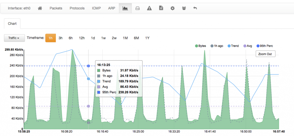
- Ability to zoom in (drill down) with the mouse by selecting the new time period on the graph.
- Data point have been smoothed for better visualisation.
- Ability to compare data with the past (time shift). On the above graph you can see (dotted grey line) the same graph on the previous period (as we’re visualising one hour, it will be the previous hour). Soon we will enable alert generation in case graphs do not overlap too much with respect to the past.
- For spiky charts as the one above depicted it is not simple to understand the trend. For this reason we have created a trend line based on this work, that allows to better understand where is the traffic trend.
- Average and percentile lines are now placed on top of the graph and animated.
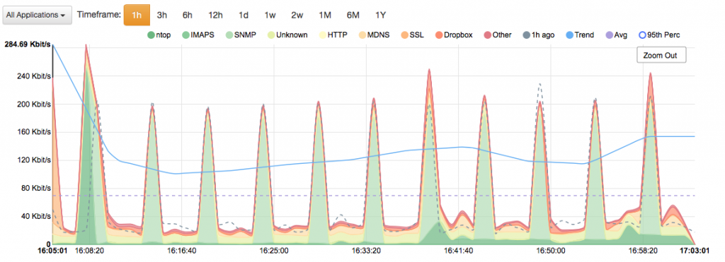
- Colors for multi-chart graphs are based on pastel colours for better visualisation.
This is not all on charts and time series, but we believe it is enough for pushing you to test the new ntopng version before the stable release, and report us suggestions and bugs.
Enjoy!