
For years ntopng has listed flows in a tabular view. Our users are used to it, and over time we have added new features and filtering capabilities. What we have not yet done, is rethink how flows are reported. Reworking the ntopng GUI is something we will tackle in the next major ntopng release, but for the time being we have started with tiny changes that should ease the process of understanding what is happening. For this reason the flow page has been extended with a new analysis menu entry.
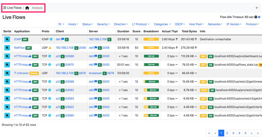
Selecting the analysis tab will bring you a new page that shows flows collapsed per protocol on a small table (see below for an example).
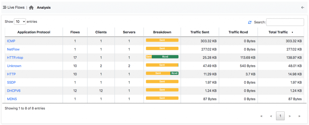 With this new table you can immediately see what are the top protocols in your network that
- Have most flows.
- Make most of the traffic.
- Have most client and server hosts.
- Are most popular for your users.
Clicking on the application protocol brings you to the list of flows for such protocol. This little enhancement available in all ntopng versions (ev branch and soon in the stable), allows our users to immediately see what is happening using a small table instead of navigating a long list of flows. All credits go to our friend Federico for suggesting this new visualisation.
Enjoy !