
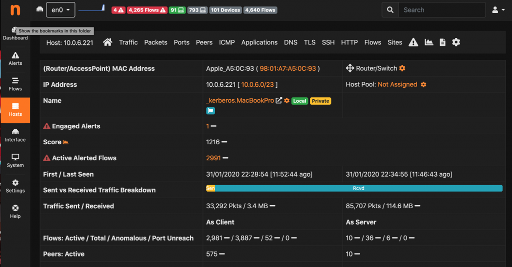
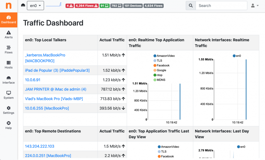
This February we’ll introduce ntopng v4 and we’re starting to write some blog posts to preview the new features. Let’s start with the user interface. Since v1 the UI has always been the same. People however asked us some more flexible layout where it is possible for instance to switch across network interfaces in a breeze. Furthermore the pervasive use of dark themes was also a driving force towards changes. While the UI in 4.2 will integrate new changes we already planned (for instance to switch from realtime to historical view, while currently it is mixed) let’s start with a new sidebar design that should leave more space on wide screens.
With the new UI, already part of the dev branch/packages, you can have both dark and light theme that you can choose/switch from the preferences panel.
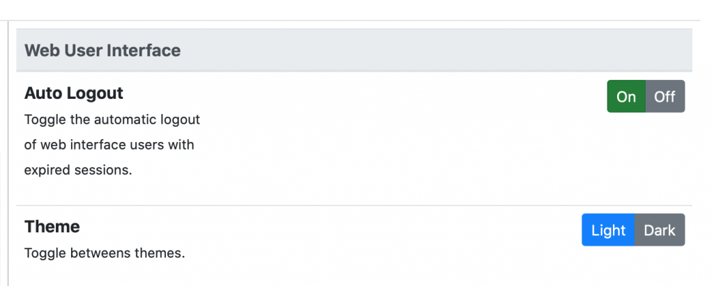
So you can decide which one fits best for your (eye) needs. Please let us know on the telegram channel your feedback as we’re still making little changes.
Enjoy!